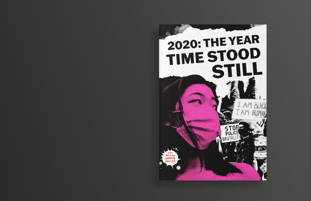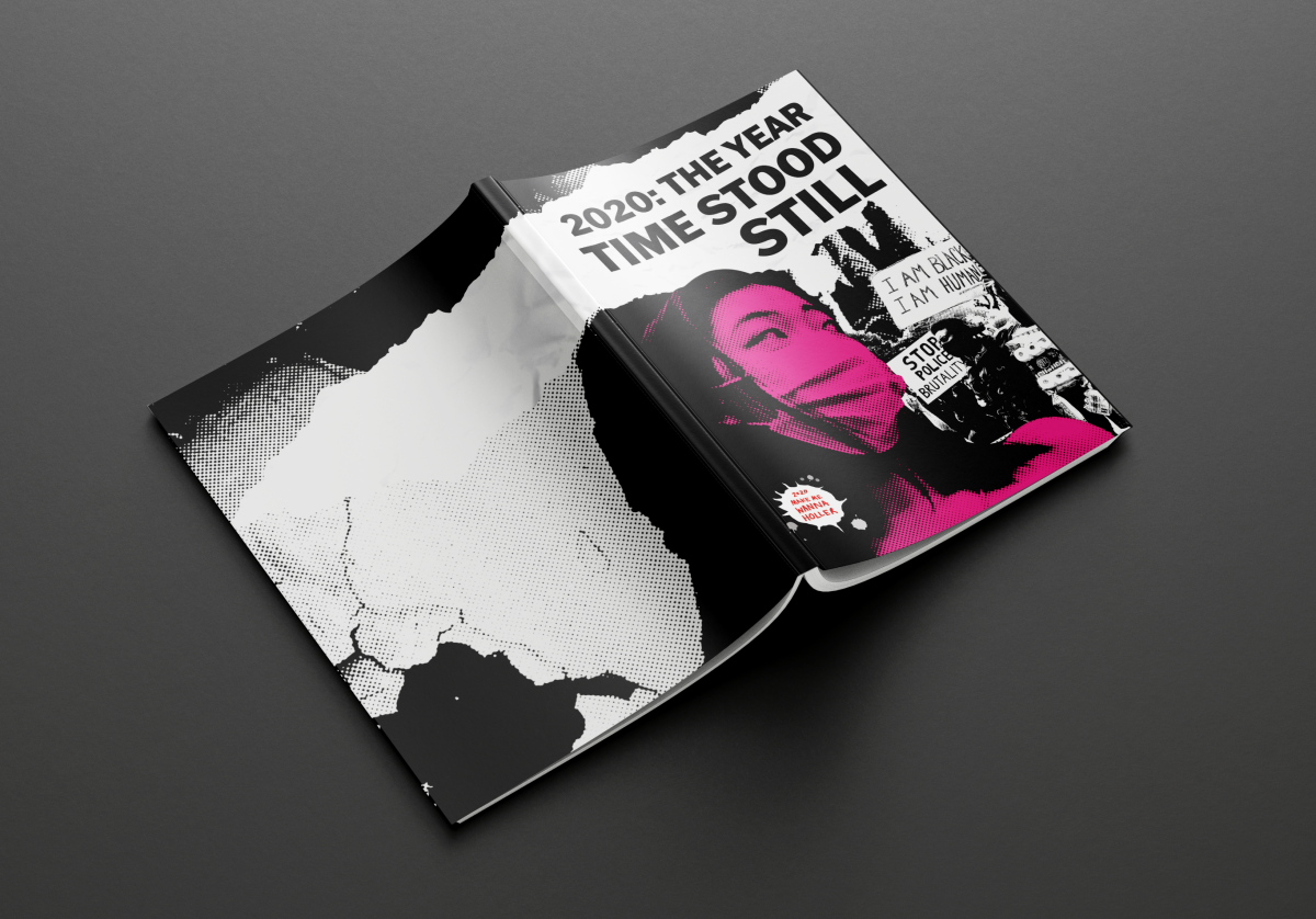
Front and Back Cover
This project began with writing five chapters about the events of 2020. I then reflected on the overall design, aiming to capture the chaotic feeling of the time and ensure the visuals conveyed that emotion.
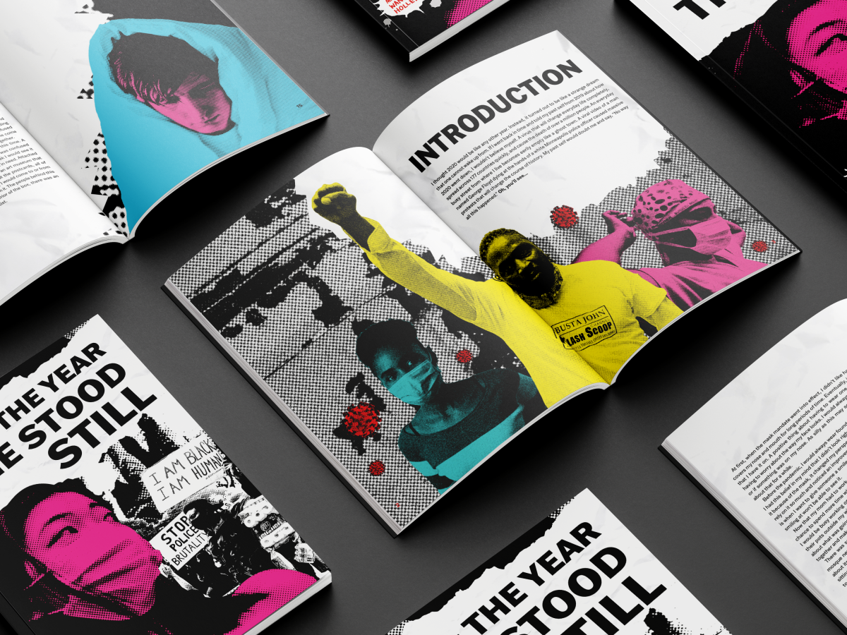
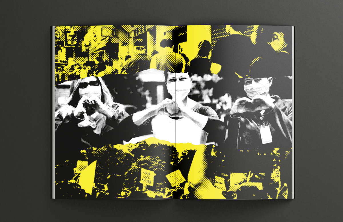
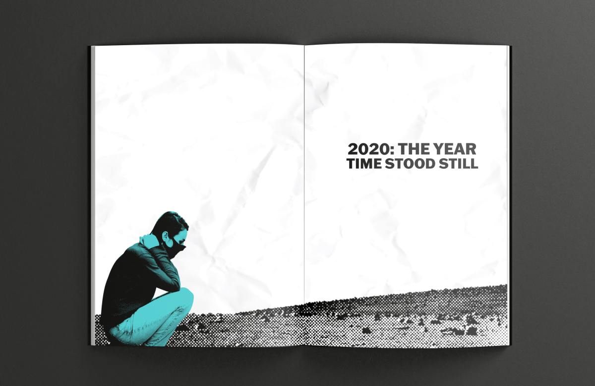
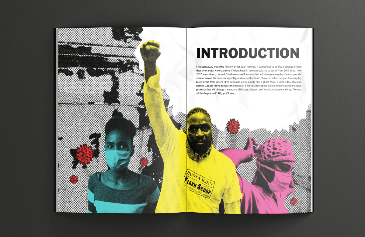
Front Cover, Pages 14-15, and Introduction Page
My inspiration came from the chaotic nature of 1970s punk posters. To invoke the feeling I was going for, I used a lot of jagged edges, rough textures, bright colors, and images from events that took place that year.
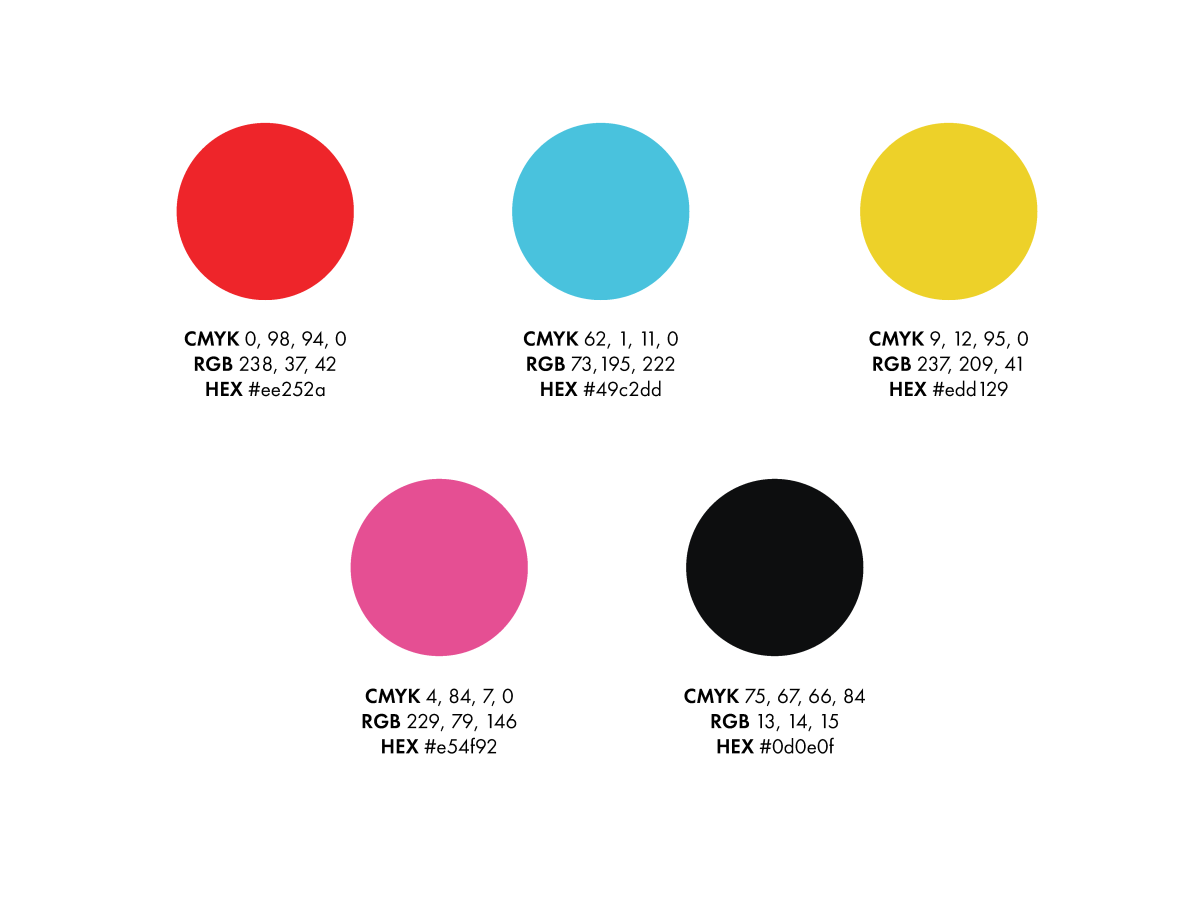
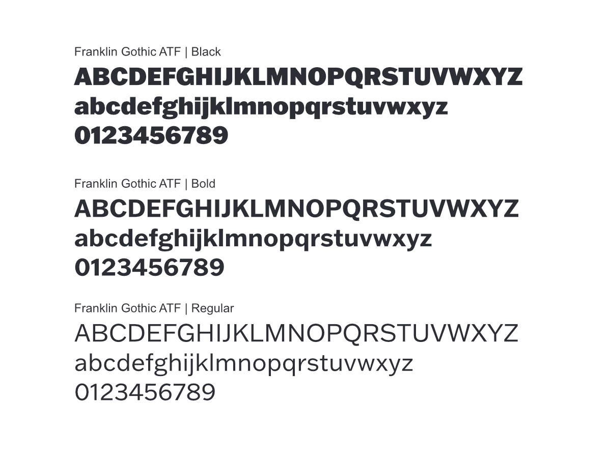
I picked a bright color palette to contrast against the black-and-white images. I used Franklin Gothic ATF for the headers and body text because its bold, clean shape complements the chaotic imagery.